

Project background
PLANNING ASSISTANT FOR EFFICIENT RESOURCE MANAGEMENT
IMS Messsysteme GmbH develops a variety of measuring systems for different industries. Before these can be delivered, they are extensively tested in the company's own test fields to ensure the perfect quality of the measuring systems. Until now, the distribution of the measuring systems in the test fields has been carried out in a non-digitised process that only allowed short-term allocation of stand spaces.
The vision
A VISUAL PLANNER TO MAXIMIZE CAPACITY USAGE
A visual planning tool shall enable the user to mark stand areas directly in test field views. The tool shall enable efficient long-term planning and make it visible. It enables the user to optimally use the available capacities.
MY ROLE
LONE DESIGNER IN A SMALL PROJECT TEAM
The project team consisted of just 4 people. Together with the project leader, 2 programmers and me as the only designer, we started the project. Together with stakeholders, I determined the scope for the research measures and got started right away.
Kickoff
DEFINING BUSINESS GOALS AND DESIGN STRATEGY
At the beginning of the project, I defined the framework of the project in a kick-off workshop with stakeholders. I got an overview of the existing problems and requirements for the tool, from a business and user perspective. Together we defined which problems and tasks our tool should solve:
RESEARCH
ANALYZING CONTEXT AND POTENTIALS
Once the business goals were set, it was important to build an understanding of which user groups the tool would serve and what problems they were currently facing.
USER INTERVIEW
GETTING TO KNOW THE PRIMARY USER AND HIS CONTEXT
To get an overview of the planner's initial situation, as well as his tasks and goals, I conducted a remote user interview. This revealed that the planner's current job would hardly be doable without his years of experience and his resulting strong gut feeling. It also helped me to understand which tools and external factors influence his work.

FIELD STUDY
IDENTIFYING FURTHER REQUIREMENTS
To get answers to contextual questions, I conducted a field study. I observed the planner in action in the test field environment and questioned him about his planning process in detail.
In the test fields, I sighted and noted various interesting features, such as...
- fixed mounting frames for special types of systems
- Floor markings for special areas that must remain clear
- safety zones and accessories for system tests
- flexible' escape routes
These special features led to further challenges, which I included in my concept considerations.


PERSONAS
DEFINING USERS AND GOALS
The interview and the field study were the basis for the creation of the primary and secondary personas. These were the basis for targeted decision-making in the subsequent ideation process and simplified discussions.
user journey
COMPARATIVE JOURNEY MAPPING TO GRASP THE CURRENT EXPERIENCE AND REQUIREMENTS
I sketched the user journey of the primary persona for his main duty: planning stand space. I used the map to break down the process into individual steps and to uncover the crucial MOTs. At the same time, I tried to find out where the tool could support and optimise the current journey.

INSIGHTS
MAIN ISSUES TO CONSIDER IN IDEATION
I summarised the core results of the research and transferred them into requirements and potentials, which I used for the conception of the tool.

2 INTALLATION TYPES
A limited number of fixed mounting frames are available for specific system types. All other systems can be placed completely freely on the available space.

Dead zones
Certain areas of space are not suitable for placing systems and must be marked as dead zones.
Furthermore, the user shall be able to add elements that stand for unspecific target spaces in the test fields.

Multiple time positions
In some cases, systems that have already been set up have to be rearranged for 'space procurement'. In this case, it must be possible to divide up the order time in order to redistribute defined spaces depending on the time period.

MULTIPLE spatial positions
If possible, the systems contained in an order are placed in groups. If the capacity utilisation does not permit this, then the user must be able to allocate several positions to an order in a single period of time.
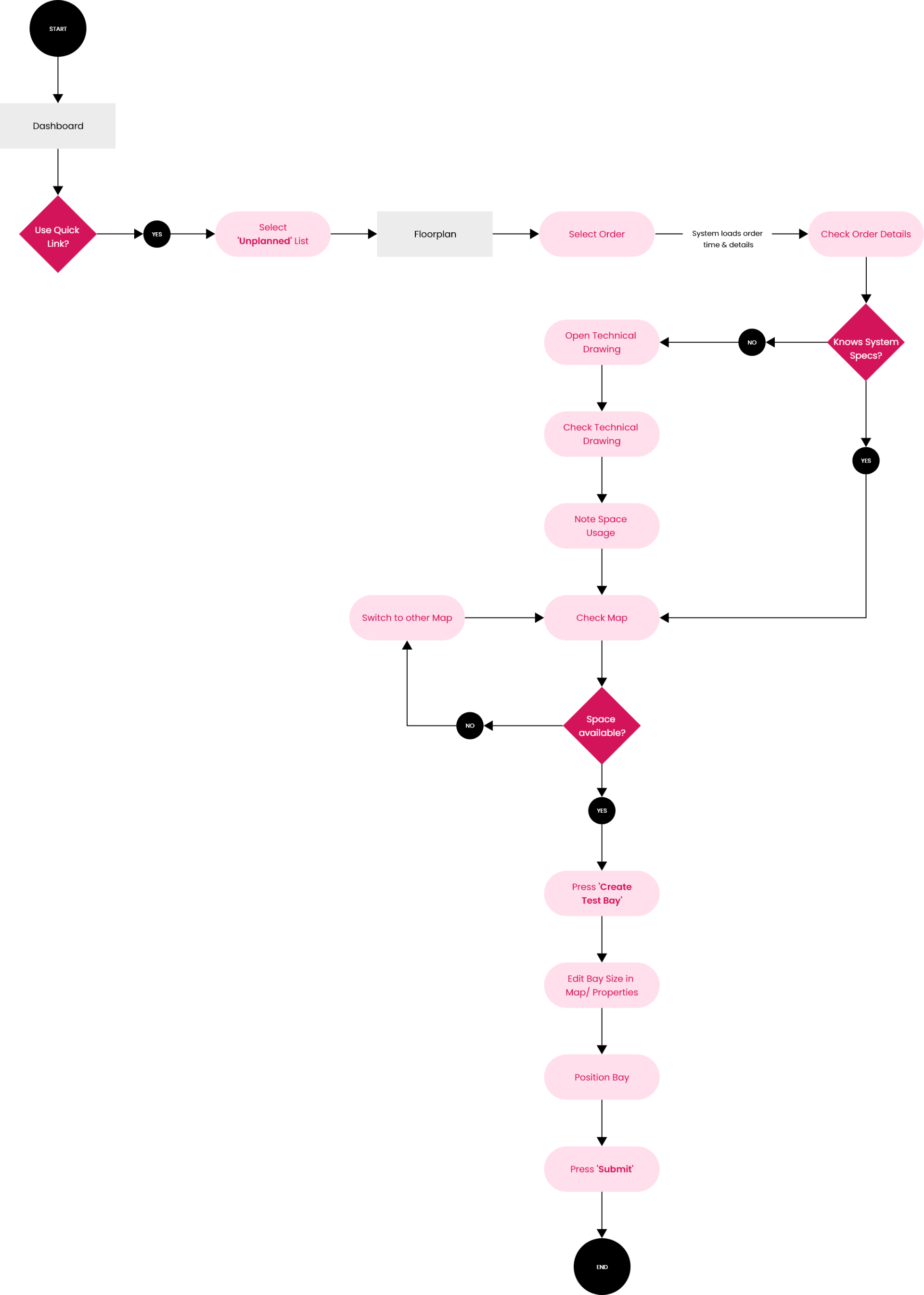
THE BASIC USER FLOW
SKETCHING OUT THE MVP VIA LOW-FI WIREFLOWS
Based on the defined user goals and tasks I sketched out the basic task flows ad transferred them into low-fidelity wireflows. This helped me to understand how the tool would support the user in achieving his goal.
ideation KEY MOMENT
ON COLLISION COURSE -
CREATING A CONCEPT TO MAKE COLLISIONS
EASY TO SOLVE
I used low-fidelity wireframes to quickly create simple collision views. These helped me understand how exactly collisions would occur, how they would manifest in map views and how users could fix them.
To understand how visible collisions in a selected period related to the respective order periods, I instinctively drew order time bars under the 'choice time period'.
I realised that this would be the key to make collisions easily manageable. By communicating the order periods visually rather than textually, I could enable users to classify collisions at a glance, both spatially and temporally. The cognitive load for classifying a collision is thus minimised as much as possible. This way, the user can focus on the actual task: fixing the collision.
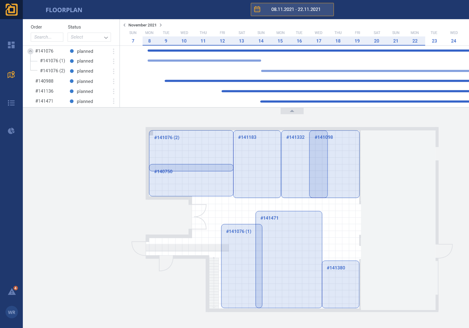
PROPOSED SOLUTION
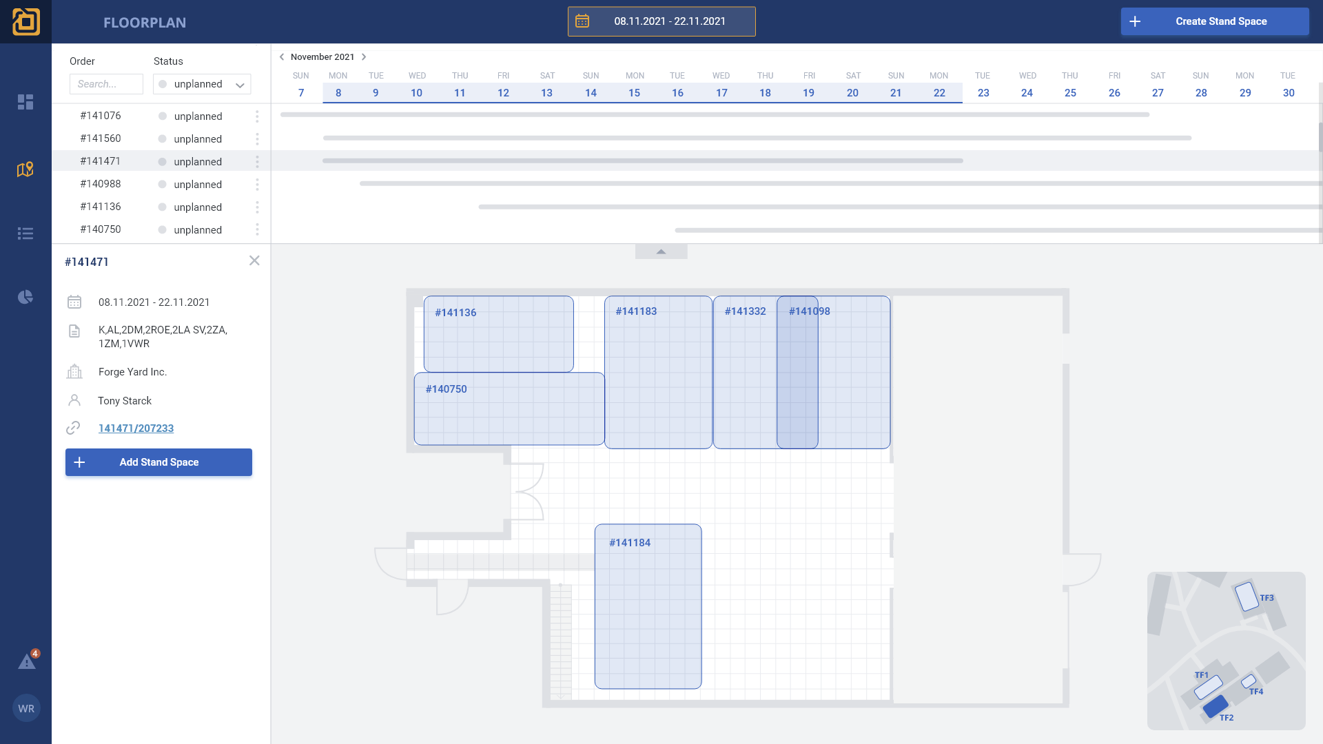
COMBINED MAP AND ORDER VIEW
The core of the solution is a combined view of the test field floor plan and order list with order time bar. By clicking on an order, the user can load the corresponding order time and is taken directly to the corresponding plan view. Filters available in the list allow the user to search for specific orders or statuses. Furthermore, a dashboard should give the user an overview of the current workload at any time and indicate trends.
mid-fidelity Wireframes
INTEGRATING FURTHER FUNCTIONS IN THE BASIC CONCEPT
In remote co-creation sessions with my team, we discussed and developed solutions for individual tasks. Due to the tight project budget, we relied on simple concepts that were perfectly aligned with the company's infrastructure.
USER FLOWs
DEFINing task flows
I worked out user flows to ensure that the task flow is as easy to use as possible for the user and aimed to keep it compact. Now, the planner can carry out his core activity, the planning of stand spaces, with just 7 clicks.
Usability Testing
REVIEWing USER ACCEPTANCE
I coordinated the objectives of the first test with stakeholders and set up the test script. I created a prototype with Figma and conducted a pre-test. During the pre-test, I noticed a few conceptual problems, which I quickly fixed for the first series of tests. This way, I was able to achieve a SUS score of 88.5 in the first round of testing.
5
Participants
3
Scenarios
88,5
SUS-Score
AFTER TEST EVALUATION
FIGURING OUT ISSUES IN THE TOOL LAYOUT AND THE POSITIONING FUNCTION
After the test, I transferred user statements and problems that I had recorded in my test protocol into requirements and potentials, for which I created new concepts.
DESIGN ITERATIONS
CONCEPT REFINEMENT AND DESIGN
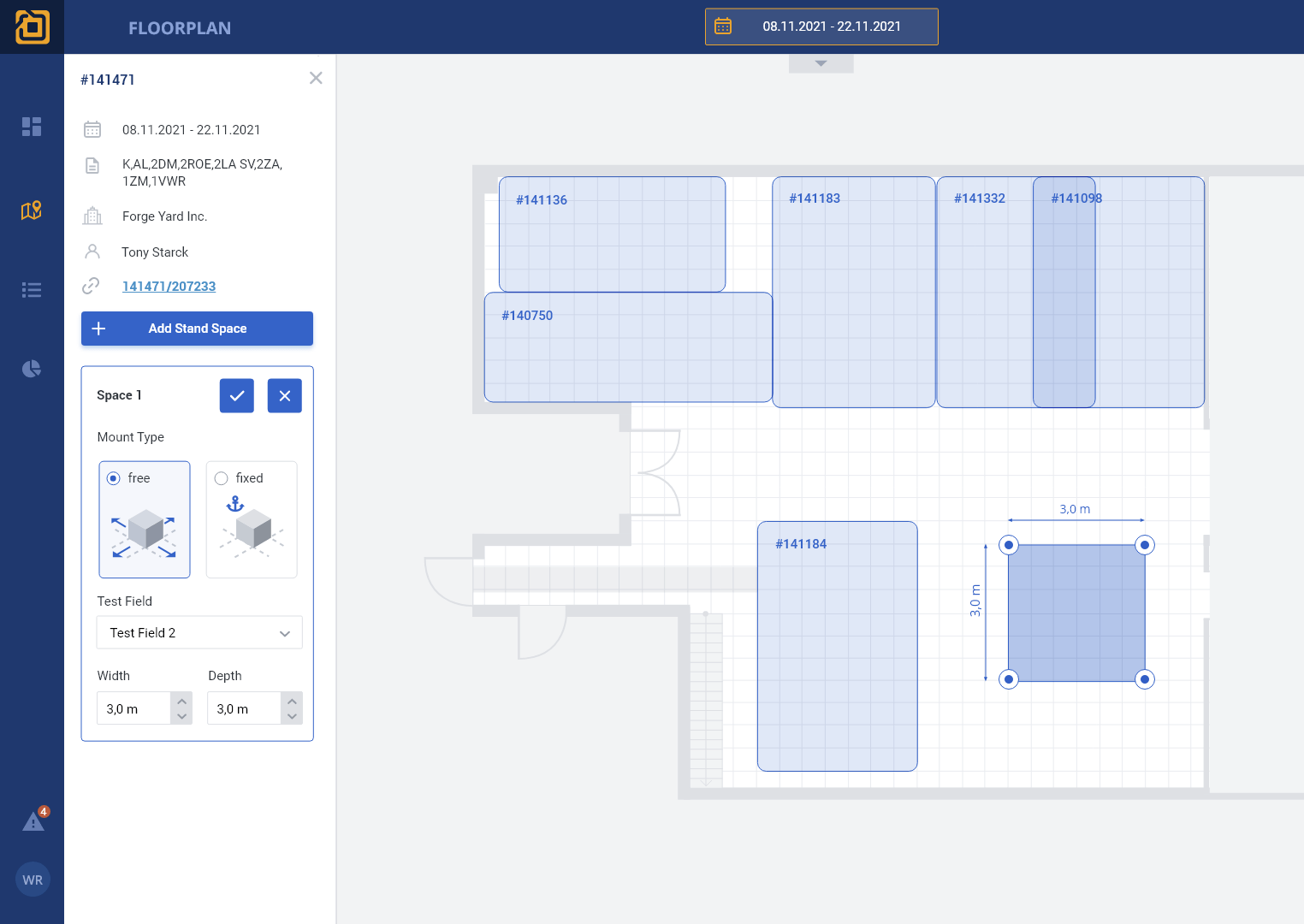
Based on the identified problems, I revised concepts and started to work out design studies. I tested different layouts, defined the design of the floor plans, revised the minimap and optimised the view of the order details.


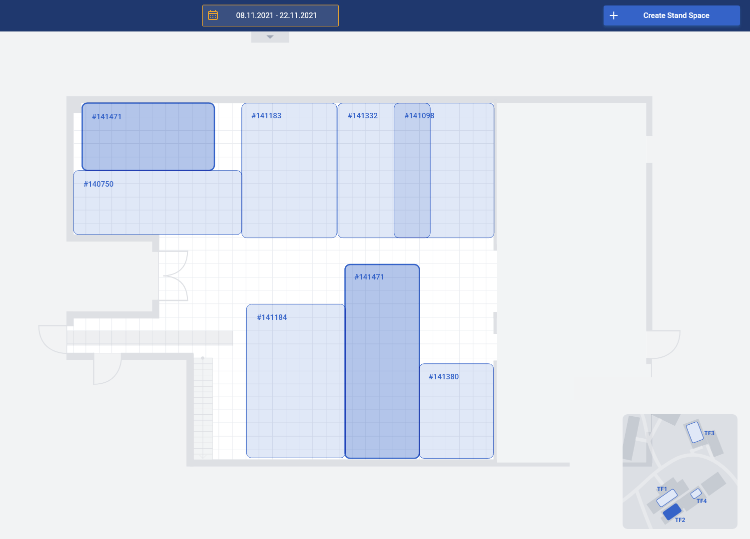
final design
ELEGANT TEST FIELD PLANNER


dashboard
CAPACITY OVERVIEW
The dashboard summarises the most important data on capacity utilisation for the planner and enables him to jump directly to the filtered floor plan via quick links.


